デモ
デモを読み込めませんでした。
仕様
- 用途
- ボタン
- 動作
- DOM
- 種類
- レシピ
- 使うもの
- DrawSVGPlugin
- 動作確認
- three 0.186.0・gsap 3.15.0
- 公開日
しくみと調整
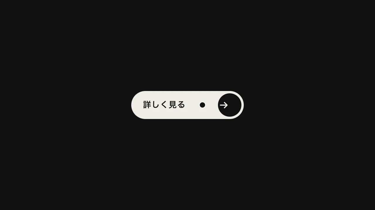
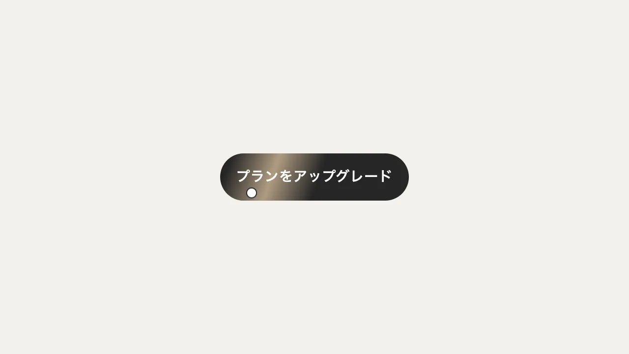
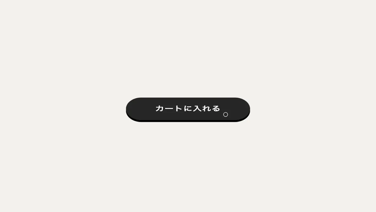
ボタンの上に、丸帯の形をした SVG のパスを重ねておき、カーソルが重なったら DrawSVGPlugin で線を 0% から 100% まで描きます。線は上の辺の左端から時計回りに 1 周し、半分ほど回ったところで、文字も補足の灰色から明るい文字の色へ変わります。離れると同じタイムラインを逆再生して、線を巻き戻します。
線は 0.9 秒の power2.inOut で描き、文字の色は 0.45 秒後から 0.3 秒かけて変えます。待機中の枠は補足の色の 1px、描く線は文字の色の 2px です。細い枠を下に敷いておくと、描く前からボタンに見え、描いた線との明るさの差でボタンが浮かび上がります。
丸帯を <rect> の角丸で書くと、DrawSVGPlugin は長さを角丸なしで測るので、描き終わりの位置が合いません。輪郭は <path> で書きます。パスの書き始めが線の出発点になるので、どこから描き始めるかもパスの順番で決まります。ボタンの幅は文字と書体で決まるため、パスは幅を測ってから作り、大きさが変わったら作り直して長さを測り直します。
巻き戻さずに先へ抜けさせるなら、離れたときに線の始点を 100% まで送ります。キーボードで移ってきたとき(focus)にも描き、動きを減らす設定では、ほぼ一瞬で切り替えます。暗い地のゴーストボタンや、制作実績・ポートフォリオへ誘うボタンに向いています。
コード
<!-- 枠線を描く SVG は、ボタンの大きさに合わせて script が形を入れる -->
<a class="draw-button" href="/works/">
  <svg class="draw-button__line" aria-hidden="true"><path /></svg>
  <span class="draw-button__label">制作実績を見る</span>
</a>.draw-button {
--ink: #eeece6; /* 描く線と、描いたあとの文字の色 */
--mute: #898989; /* 待機中の枠と文字の色 */
position: relative;
display: inline-grid;
place-items: center;
height: 48px;
padding: 0 32px;
border-radius: 999px;
/* 待機中の細い枠。描く前からボタンに見え、描いた線との差で明るく浮かぶ */
box-shadow: inset 0 0 0 1px var(--mute);
color: var(--mute);
font-size: 15px;
font-weight: 600;
line-height: 1;
letter-spacing: 0.04em;
text-decoration: none;
white-space: nowrap;
}
/* 描く線。ボタンと同じ大きさで重ね、線の太さの半分だけ内側を通す */
.draw-button__line {
position: absolute;
inset: 0;
width: 100%;
height: 100%;
overflow: visible;
pointer-events: none;
fill: none;
stroke: var(--ink);
stroke-width: 2;
}
.draw-button__label {
position: relative;
}
.draw-button:focus-visible {
outline: 2px solid var(--ink);
outline-offset: 4px;
}import { gsap } from "gsap";
import { DrawSVGPlugin } from "gsap/DrawSVGPlugin";
gsap.registerPlugin(DrawSVGPlugin);
const reduceMotion = window.matchMedia("(prefers-reduced-motion: reduce)").matches;
// 丸帯の輪郭。上の辺の左端から時計回りに 1 周する(線はこの向きに描かれる)。
// <rect rx> で書くと、DrawSVGPlugin が角丸なしの長さで測るので、描き終わりが合わない
function pillPath(w, h, inset) {
const r = h / 2 - inset;
const x0 = inset + r;
const x1 = w - inset - r;
return `M${x0} ${inset} H${x1} A${r} ${r} 0 0 1 ${x1} ${h - inset} H${x0} A${r} ${r} 0 0 1 ${x0} ${inset}`;
}
document.querySelectorAll(".draw-button").forEach((button) => {
const svg = button.querySelector(".draw-button__line");
const line = svg.querySelector("path");
const label = button.querySelector(".draw-button__label");
const style = getComputedStyle(button);
const [ink, mute] = ["--ink", "--mute"].map((name) => style.getPropertyValue(name).trim());
let hover = null;
// ボタンの幅は文字と書体で決まる。大きさが変わるたびに輪郭を作り直し、線の長さを測り直す。
// viewBox を付けないので、座標は画面の px のまま(幅の端数も offsetWidth と違って丸めない)
const build = () => {
const { width: w, height: h } = getComputedStyle(svg);
const inset = Number.parseFloat(getComputedStyle(line).strokeWidth) / 2;
line.setAttribute("d", pillPath(Number.parseFloat(w), Number.parseFloat(h), inset));
const progress = hover ? hover.progress() : 0;
hover?.kill();
hover = gsap
.timeline({ paused: true })
.fromTo(line, { drawSVG: "0%" }, { drawSVG: "100%", duration: 0.9, ease: "power2.inOut" }, 0)
// 線が半分ほど回ったところで、文字も明るくする
.fromTo(label, { color: mute }, { color: ink, duration: 0.3, ease: "none" }, 0.45)
.progress(progress);
// 動きを減らす設定では、ほぼ一瞬で切り替える
if (reduceMotion) hover.timeScale(20);
};
new ResizeObserver(build).observe(button);
const draw = () => hover?.play();
const rewind = () => hover?.reverse();
button.addEventListener("pointerenter", draw);
button.addEventListener("pointerleave", rewind);
button.addEventListener("focus", draw);
button.addEventListener("blur", rewind);
});