デモ
デモを読み込めませんでした。
仕様
- 用途
- ボタン
- 動作
- DOM
- 種類
- レシピ
- 動作確認
- three 0.186.0・gsap 3.15.0
- 公開日
しくみと調整
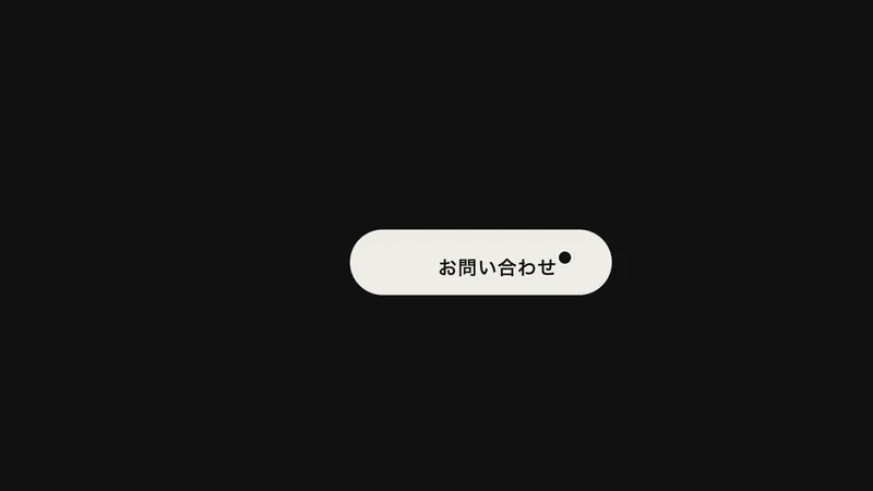
ボタンの下の外に、幅 150%・高さ 2.5 倍の楕円を隠しておき、カーソルが重なったら持ち上げます。楕円の中心がボタンの縦の中央に来たところで、ボタン全体が塗りで埋まります。
文字の色は、楕円のふちが文字を通り過ぎる 0.04〜0.12 秒のあいだに切り替えます。これより遅いと、塗りの上に同じ明るさの文字が残り、一瞬読めなくなります。
枠線は、ボタン自身の border ではなく、塗りの上に重ねた ::after で描きます。border のままだと、枠と塗りの境目に地の色が細く透けるためです。
動きは止めたタイムライン 1 本にまとめ、重なったら play()、離れたら reverse() します。途中で離れても、その位置から引き返します。
楕円の幅を 100% に近づけると水面の丸みが強くなり、ease を power3.inOut にすると液体らしい重さが出ます。申し込み・送信・ナビゲーションのボタンに向いています。
コード
<a class="fill-button" href="/contact/">
  <span class="fill-button__fill" aria-hidden="true"></span>
  <span class="fill-button__label">無料ではじめる</span>
</a>.fill-button {
--ink: #eeece6; /* 文字と枠の色 */
--ground: #111111; /* 地の色。満ちたあとの文字の色になる */
position: relative;
display: inline-grid;
place-items: center;
height: 48px;
padding: 0 32px;
border-radius: 999px;
overflow: hidden;
isolation: isolate;
color: var(--ink);
font-size: 15px;
font-weight: 600;
letter-spacing: 0.04em;
text-decoration: none;
white-space: nowrap;
}
/* 枠は塗りの上に重ねる(border にすると、枠と塗りの境目に地の色が細く透ける) */
.fill-button::after {
content: "";
position: absolute;
inset: 0;
border: 1px solid var(--ink);
border-radius: inherit;
pointer-events: none;
}
/* 満ちる塗り。幅 150% の楕円を、ボタンの下の外に置いておく */
.fill-button__fill {
position: absolute;
top: 100%;
left: -25%;
z-index: -1;
width: 150%;
height: 250%;
border-radius: 50%;
background: var(--ink);
}
.fill-button:focus-visible {
outline: 2px solid var(--ink);
outline-offset: 4px;
}import { gsap } from "gsap";
const reduceMotion = window.matchMedia("(prefers-reduced-motion: reduce)").matches;
document.querySelectorAll(".fill-button").forEach((button) => {
const fill = button.querySelector(".fill-button__fill");
const label = button.querySelector(".fill-button__label");
const ground = getComputedStyle(button).getPropertyValue("--ground").trim();
// 楕円の中心がボタンの縦の中央に来るまで持ち上げると、ボタン全体が埋まる
const rise = (button.offsetHeight + fill.offsetHeight) / 2;
const hover = gsap
.timeline({ paused: true })
.to(fill, { y: -rise, duration: 0.5, ease: "power2.out" }, 0)
// 楕円のふちが文字を通り過ぎるあいだに、文字の色を切り替える
.to(label, { color: ground, duration: 0.08, ease: "none" }, 0.04);
// 動きを減らす設定では、ほぼ一瞬で切り替える
if (reduceMotion) hover.timeScale(20);
const fillUp = () => hover.play();
const drain = () => hover.reverse();
button.addEventListener("pointerenter", fillUp);
button.addEventListener("pointerleave", drain);
button.addEventListener("focus", fillUp);
button.addEventListener("blur", drain);
});