デモ
デモを読み込めませんでした。
仕様
- 用途
- ヒーロー
- 動作
- DOM
- 種類
- レシピ
- 動作確認
- three 0.186.0・gsap 3.15.0
- 公開日
しくみと調整
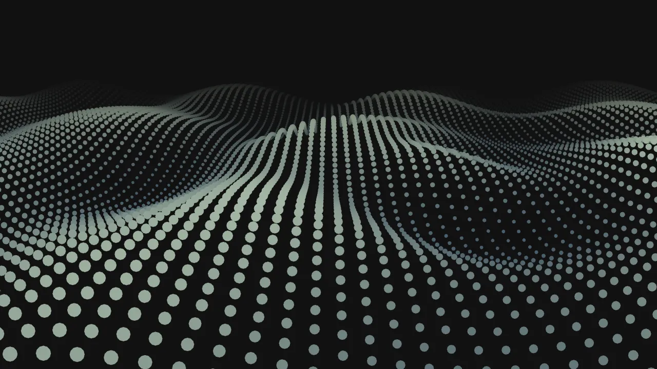
点を並べたグリッドに、GSAPのstaggerで中心から外へ向かう遅れを配っています。中心に近い点ほど早く動き出し、遠い点ほど遅れて動くので、輪が外へ広がるように見えます。
yoyoとrepeatは、この設定の中に書きます。外側に書くと、点全体がまとめて往復する動きになってしまいます。
常に動き続ける背景の飾りなので、動きを減らす設定のときは波紋を出さず、小さな点が並んだ静かな見た目のまま止めています。色の変化も、波が通り過ぎる一瞬だけの装飾として扱ってください。
行数・列数や点と点の間隔を変えると、グリッドの密度や余白の印象を調整できます。色を別の色に替えれば、ブランドカラーにも合わせやすくなります。背景の装飾や、読み込み中の表示に向いています。
コード
<section class="dot-hero">
  <!-- 背景は飾りなので、読み上げからは外す -->
  <div class="dot-hero__grid" aria-hidden="true"></div>
  <div class="dot-hero__inner">
    <p class="dot-hero__eyebrow">Community</p>
    <h1 class="dot-hero__title">つながりが、<br>広がっていく。</h1>
    <p class="dot-hero__lead">ここに説明文が入ります。</p>
    <a class="dot-hero__button" href="/signup/">無料ではじめる</a>
  </div>
</section>.dot-hero {
--bg: #f2f1ed;
--ink: #262626;
--ripple: #ba7069; /* 波紋が通るときの色(くすみローズ) */
--gutter: clamp(24px, 7vw, 96px);
position: relative;
display: grid;
align-items: center;
min-height: min(90vh, 720px);
padding: 0 var(--gutter);
overflow: hidden;
color: var(--ink);
background-color: var(--bg);
}
.dot-hero__grid {
position: absolute;
inset: 0;
display: grid;
grid-template-columns: repeat(16, 1fr);
grid-template-rows: repeat(9, 1fr);
}
.dot-hero__dot {
place-self: center;
width: 60%;
aspect-ratio: 1;
border-radius: 50%;
background-color: var(--ink);
}
.dot-hero__dot.is-hidden { visibility: hidden; }
.dot-hero__inner {
position: relative; /* 背景の上に載せる */
max-width: 34em;
}
.dot-hero__eyebrow {
margin: 0;
font-size: 13px;
font-weight: 700;
letter-spacing: 0.14em;
text-transform: uppercase;
}
.dot-hero__title {
margin: 24px 0 0;
font-size: clamp(40px, 8vw, 72px);
line-height: 1.05;
letter-spacing: -0.02em;
}
.dot-hero__lead {
margin: 24px 0 0;
font-size: 18px;
line-height: 1.8;
}
.dot-hero__button {
display: inline-grid;
place-items: center;
height: 48px;
margin-top: 32px;
padding: 0 32px;
border-radius: 999px;
background-color: var(--ink);
color: var(--bg);
font-size: 15px;
font-weight: 600;
letter-spacing: 0.04em;
text-decoration: none;
}
.dot-hero__button:focus-visible { outline: 2px solid var(--ink); outline-offset: 4px; }import { gsap } from "gsap";
const COLS = 16;
const ROWS = 9;
const GAP = 0.5; // 波と波の間の静止時間(秒)
const CLEAR = 12; // 字の周りに点を置かない幅(px)
const reduceMotion = window.matchMedia("(prefers-reduced-motion: reduce)").matches;
document.querySelectorAll(".dot-hero").forEach((hero) => {
const grid = hero.querySelector(".dot-hero__grid");
const inner = hero.querySelector(".dot-hero__inner");
const style = getComputedStyle(hero);
// 色は CSS 変数から読む。GSAP は var(--name) のままでは補間できないので、値にして渡す
const ink = style.getPropertyValue("--ink").trim();
const ripple = style.getPropertyValue("--ripple").trim();
const dots = [];
const fragment = document.createDocumentFragment();
for (let i = 0; i < COLS * ROWS; i++) {
const dot = document.createElement("span");
dot.className = "dot-hero__dot";
fragment.append(dot);
dots.push(dot);
}
grid.append(fragment);
// 字とボタンの後ろに来る点は隠す(波紋は隠れた点も同じ間合いで通る)
function clearBehindText() {
const boxes = [inner.querySelector(".dot-hero__button").getBoundingClientRect()];
const walker = document.createTreeWalker(inner, NodeFilter.SHOW_TEXT);
const range = document.createRange();
while (walker.nextNode()) {
range.selectNodeContents(walker.currentNode);
boxes.push(...range.getClientRects());
}
const origin = grid.getBoundingClientRect();
for (const dot of dots) {
// 拡大したときの大きさで比べる(transform の影響を受けない offset で測る)
const left = origin.left + dot.offsetLeft - CLEAR;
const top = origin.top + dot.offsetTop - CLEAR;
const right = left + dot.offsetWidth + CLEAR * 2;
const bottom = top + dot.offsetHeight + CLEAR * 2;
const hit = boxes.some((b) => b.width > 0 && left < b.right && right > b.left && top < b.bottom && bottom > b.top);
dot.classList.toggle("is-hidden", hit);
}
}
const observer = new ResizeObserver(clearBehindText);
observer.observe(hero);
observer.observe(inner);
if (reduceMotion) {
// 休んでいる小さな粒のまま止める(波紋は出さない)
gsap.set(dots, { scale: 0.25, backgroundColor: ink });
return;
}
// yoyo / repeat は stagger の中に書く(外に書くと、全体がまとめて往復してしまう)
gsap.timeline({ repeat: -1, repeatDelay: GAP }).fromTo(
dots,
{ scale: 0.25, backgroundColor: ink },
{
scale: 1,
backgroundColor: ripple,
duration: 0.35,
ease: "sine.inOut",
stagger: { each: 0.08, grid: [ROWS, COLS], from: "center", yoyo: true, repeat: 1 },
}
);
});