デモ
デモを読み込めませんでした。
仕様
- 用途
- ヒーロー
- 動作
- DOM
- 種類
- レシピ
- 動作確認
- three 0.186.0・gsap 3.15.0
- 公開日
しくみと調整
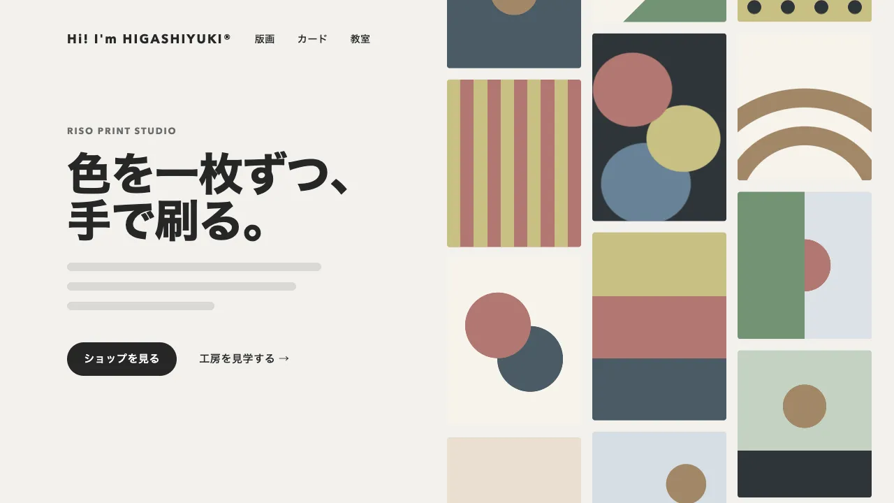
丸・三角・四角の小さな図形を並べ、それぞれをゆっくり上下に揺らしながら回しています。三角形は 120 度、四角形は 90 度回すと元の見た目にちょうど重なるので、その角度の倍数だけ回せば、どこで止めても形が破綻しません。
上下の揺れは図形ごとに周期や位相をずらしていて、全部がそろって動かないようにしています。影は図形の外側の要素に付けているので、内側で回転しても影の向きは変わりません。
位置や大きさは、画面の高さに対する比率で指定しています。こうしておくと、画面の大きさが変わっても計算をやり直す必要がありません。動きを減らす設定のときは、揺れも回転も止め、静かに並んだ見た目のままにしています。
図形の色や配置、揺れの大きさを変えれば、にぎやかさを自由に調整できます。明るく親しみやすい印象になるので、子ども向けサービスや教育、イベント系のヒーローに向いています。
コード
<section class="shape-hero">
  <!-- 背景は飾りなので、読み上げからは外す -->
  <div class="shape-hero__field" aria-hidden="true"></div>
  <div class="shape-hero__inner">
    <p class="shape-hero__eyebrow">Workshop</p>
    <h1 class="shape-hero__title">あそびながら、<br>まなぼう。</h1>
    <p class="shape-hero__lead">ここに説明文が入ります。</p>
    <a class="shape-hero__button" href="/workshops/">予約する</a>
  </div>
</section>.shape-hero {
--bg: #f2f1ed;
--ink: #262626;
/* 形の色。script.js はこの名前だけを参照し、値はここでだけ決める。色相より明るさを離す */
--olive: #c8bf83;
--rose: #b27771;
--slate: #688297;
--sage: #739374;
--lavender: #877fa1;
--deep: #4a5b66;
--gutter: clamp(24px, 7vw, 96px);
position: relative;
display: grid;
align-items: center;
min-height: min(90vh, 720px);
padding: 0 var(--gutter);
overflow: hidden;
color: var(--ink);
background-color: var(--bg);
}
.shape-hero__field {
position: absolute;
inset: 0;
pointer-events: none;
container-type: size; /* 子の cqw / cqh を、この箱の大きさから決める */
}
.shape-hero__shape {
position: absolute;
left: var(--x);
top: var(--y);
width: var(--size);
height: var(--size);
/* 位置は中心を基準にし、浮遊は -1..1 の値(--sx / --sy)に振れ幅(--ax / --ay)を掛けて足す */
transform: translate(-50%, -50%) translate(calc(var(--sx, 0) * var(--ax)), calc(var(--sy, 0) * var(--ay)));
}
/* 影は浮遊する外側に付けるので、回っても向きが変わらない */
.shape-hero__shape--fill { filter: drop-shadow(0 calc(var(--size) * 0.1) calc(var(--size) * 0.14) rgba(38, 38, 38, 0.14)); }
.shape-hero__shape svg {
display: block;
width: 100%;
height: 100%;
overflow: visible;
transform: rotate(var(--rot, 0deg)); /* 回転は内側だけにかける */
}
.shape-hero__inner {
position: relative; /* 背景の上に載せる */
max-width: 34em;
}
.shape-hero__eyebrow {
margin: 0;
font-size: 13px;
font-weight: 700;
letter-spacing: 0.14em;
text-transform: uppercase;
}
.shape-hero__title {
margin: 24px 0 0;
font-size: clamp(40px, 8vw, 72px);
line-height: 1.05;
letter-spacing: -0.02em;
}
.shape-hero__lead {
margin: 24px 0 0;
font-size: 18px;
line-height: 1.8;
}
.shape-hero__button {
display: inline-grid;
place-items: center;
height: 48px;
margin-top: 32px;
padding: 0 32px;
border-radius: 999px;
background-color: var(--ink);
color: var(--bg);
font-size: 15px;
font-weight: 600;
letter-spacing: 0.04em;
text-decoration: none;
}
.shape-hero__button:focus-visible { outline: 2px solid var(--ink); outline-offset: 4px; }import { gsap } from "gsap";
const SVG_NS = "http://www.w3.org/2000/svg";
const DURATION = 8; // ひと回りして同じ位置・角度に戻るまで(秒)
const SYMMETRY = { circle: 0, triangle: 120, square: 90 }; // この角度だけ回すと元の形に重なる
// x, y: 中心(画面比) / size: 大きさ(高さ比) / float: 浮遊の振れ幅(高さ比) / f: 上下の周波数
// spin: 1 ループで回る「対称角」の数(整数) / phase: 各形をずらす位相
// color: 色は CSS 変数の名前(値そのものは style.css に書く)
const SHAPES = [
{ type: "circle", x: 0.13, y: 0.26, size: 0.17, color: "--olive", fill: true, float: 0.03, f: 1, spin: 0, phase: 0 },
{ type: "triangle", x: 0.27, y: 0.74, size: 0.21, color: "--rose", fill: true, float: 0.035, f: 1, spin: 1, phase: 1.2 },
{ type: "square", x: 0.8, y: 0.27, size: 0.16, color: "--slate", fill: true, float: 0.025, f: 2, spin: -1, phase: 2 },
{ type: "circle", x: 0.86, y: 0.74, size: 0.12, color: "--sage", fill: false, float: 0.03, f: 1, spin: 0, phase: 2.8 },
{ type: "square", x: 0.5, y: 0.13, size: 0.08, color: "--lavender", fill: false, float: 0.02, f: 2, spin: 1, phase: 3.5 },
{ type: "triangle", x: 0.63, y: 0.84, size: 0.11, color: "--deep", fill: false, float: 0.025, f: 1, spin: -1, phase: 4.1 },
{ type: "circle", x: 0.4, y: 0.36, size: 0.05, color: "--slate", fill: true, float: 0.02, f: 2, spin: 0, phase: 4.8 },
{ type: "square", x: 0.07, y: 0.64, size: 0.07, color: "--lavender", fill: false, float: 0.02, f: 1, spin: 1, phase: 5.3 },
{ type: "circle", x: 0.95, y: 0.1, size: 0.06, color: "--rose", fill: true, float: 0.015, f: 2, spin: 0, phase: 0.6 },
{ type: "triangle", x: 0.21, y: 0.09, size: 0.08, color: "--sage", fill: true, float: 0.02, f: 1, spin: 1, phase: 1.9 },
{ type: "square", x: 0.66, y: 0.52, size: 0.07, color: "--olive", fill: true, float: 0.025, f: 1, spin: -1, phase: 3 },
{ type: "circle", x: 0.73, y: 0.4, size: 0.035, color: "--deep", fill: false, float: 0.02, f: 2, spin: 0, phase: 5.9 },
];
const reduceMotion = window.matchMedia("(prefers-reduced-motion: reduce)").matches;
// 100 × 100 の座標で形を描く。三角は重心を (50, 50) に置くので、回しても対称に重なる
function shapeSvg({ type, color, fill }) {
const svg = document.createElementNS(SVG_NS, "svg");
svg.setAttribute("viewBox", "0 0 100 100");
const node = document.createElementNS(SVG_NS, type === "circle" ? "circle" : type === "square" ? "rect" : "polygon");
const geometry = {
circle: { cx: 50, cy: 50, r: 46 },
square: { x: 9, y: 9, width: 82, height: 82, rx: 14 },
triangle: { points: "50,4 89.84,73 10.16,73" },
}[type];
const width = fill ? 8 : 4;
node.style.cssText = `stroke-width:${width}px;stroke-linejoin:round;fill:${fill ? `var(${color})` : "none"};stroke:var(${color});`;
if (!fill) node.setAttribute("vector-effect", "non-scaling-stroke");
for (const [key, value] of Object.entries(geometry)) node.setAttribute(key, String(value));
svg.append(node);
return svg;
}
document.querySelectorAll(".shape-hero__field").forEach((field) => {
const nodes = SHAPES.map((shape) => {
const node = document.createElement("div");
node.className = `shape-hero__shape${shape.fill ? " shape-hero__shape--fill" : ""}`;
// 位置・大きさ・振れ幅は cqw / cqh にしておくと、画面の大きさが変わっても計算し直さずに済む
node.style.cssText = `--x:${shape.x * 100}cqw;--y:${shape.y * 100}cqh;--size:${shape.size * 100}cqh;--ax:${shape.float * 40}cqh;--ay:${shape.float * 100}cqh;`;
node.append(shapeSvg(shape));
field.append(node);
return node;
});
if (reduceMotion) return; // 揺れ・回転(--sx / --sy / --rot)を書かなければ、静かに並んだまま
gsap.ticker.add((time) => {
const angle = (time / DURATION) * Math.PI * 2;
SHAPES.forEach((shape, i) => {
const rot = shape.spin * SYMMETRY[shape.type] * (time / DURATION) + 8 * Math.sin(angle + shape.phase);
nodes[i].style.setProperty("--sx", Math.sin(angle + shape.phase * 1.7).toFixed(4));
nodes[i].style.setProperty("--sy", Math.sin(angle * shape.f + shape.phase).toFixed(4));
nodes[i].style.setProperty("--rot", `${rot.toFixed(2)}deg`);
});
});
});