デモ
デモを読み込めませんでした。
仕様
- 用途
- ナビゲーション
- 動作
- DOM
- 種類
- レシピ
- 動作確認
- three 0.186.0・gsap 3.15.0
- 公開日
しくみと調整
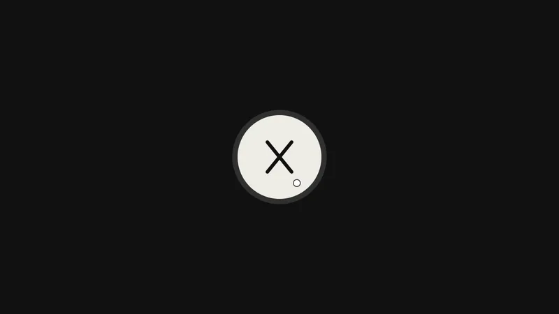
画面の右の外に置いたパネルを、押されたら横へ滑り込ませます。パネルの中のリンクは、1 行ずつ overflow で切った枠に入れてあり、枠の下から順にせり上がります。3 本線は同時に × へ変わり、後ろのページは半透明の幕で暗くします。
パネルは 0.7 秒の power4.inOut、リンクは 1 行 0.6 秒の power3.out を 0.07 秒ずつずらして重ねます。リンクが動き出すのはパネルの 0.35 秒後で、パネルが止まりきる前に始めると、2 つの動きがひと続きに見えます。開閉は 1 本のタイムラインにまとめ、閉じるときは 1.5 倍速で逆再生するので、リンクが下の段から沈んでからパネルが引きます。
パネルの初期位置を、CSS の transform に書いてはいけません。GSAP がそれを px の移動量として読み込むので、xPercent を 0 に戻してもパネルがずれたまま出てきます。初期位置は、開くトゥイーンの始点として持たせます。
開閉は、見た目だけでなく読み上げにも伝えます。押すたびに aria-expanded を書き換え、閉じているあいだはパネルを hidden にして読み上げから外します。焦点も一緒に移し、開いたら先頭のリンクへ、閉じたら押したボタンへ戻します。
上から下ろす形にするなら、横の移動を縦に替えるだけで同じ動きになります。リンクが増えるほど全体が長くなるので、段数の多いメニューではずらす間隔を 0.04 秒ほどまで詰めます。スマートフォンのナビゲーションや、PC のドロワーメニューに向いています。
コード
<button class="menu-toggle" type="button" aria-expanded="false" aria-controls="site-menu" aria-label="メニューを開く">
  <!-- 線は飾りなので読み上げから外す。状態は aria-expanded、名前は aria-label が持つ -->
  <span class="menu-toggle__bar" aria-hidden="true"></span>
  <span class="menu-toggle__bar" aria-hidden="true"></span>
  <span class="menu-toggle__bar" aria-hidden="true"></span>
</button>

<div class="menu-scrim" aria-hidden="true"></div>

<!-- hidden は display:none なので、閉じている間は読み上げにも出ない -->
<nav id="site-menu" class="site-menu" aria-label="メインメニュー" hidden>
  <ul class="site-menu__list">
    <li class="site-menu__row">
      <a class="site-menu__link" href="/work/"><span class="site-menu__num">01</span>Work</a>
    </li>
    <li class="site-menu__row">
      <a class="site-menu__link" href="/studio/"><span class="site-menu__num">02</span>Studio</a>
    </li>
    <li class="site-menu__row">
      <a class="site-menu__link" href="/services/"><span class="site-menu__num">03</span>Services</a>
    </li>
    <li class="site-menu__row">
      <a class="site-menu__link" href="/journal/"><span class="site-menu__num">04</span>Journal</a>
    </li>
    <li class="site-menu__row">
      <a class="site-menu__link" href="/contact/"><span class="site-menu__num">05</span>Contact</a>
    </li>
  </ul>
  <p class="site-menu__foot">
    <span>Careers · Press</span>
    <a href="/contact/">制作のご相談 →</a>
  </p>
</nav>.menu-toggle {
--ink: #eeece6; /* 線の色 */
--step: 8px; /* 上下の線を中央からずらす量(線 2px + 間 6px) */
position: relative;
z-index: 3; /* パネルより上(開いている間は閉じるボタンになる) */
width: 48px; /* 線は 24px。指でも押せるよう、まわりに余白を取る */
height: 48px;
padding: 0;
border: 0;
background: none;
cursor: pointer;
-webkit-appearance: none;
appearance: none;
}
/* 3 本とも中央に重ねて置き、上下だけ --step ぶんずらす。× にするときは中央へ戻すだけで済む */
.menu-toggle__bar {
position: absolute;
left: 50%;
top: 50%;
width: 24px;
height: 2px;
margin: -1px 0 0 -12px;
background-color: var(--ink);
}
.menu-toggle__bar:first-of-type { transform: translateY(calc(var(--step) * -1)); }
.menu-toggle__bar:last-of-type { transform: translateY(var(--step)); }
.menu-toggle:focus-visible { outline: 2px solid var(--ink); outline-offset: 4px; }
/* 後ろのページを暗くする幕。出し入れは autoAlpha に任せるので、休みは opacity と visibility で隠す */
.menu-scrim {
position: fixed;
z-index: 1;
inset: 0;
opacity: 0;
visibility: hidden;
background-color: rgba(17, 17, 17, 0.4);
}
.site-menu {
--ink: #eeece6;
--mute: #a8a6a0;
--line: rgba(238, 236, 230, 0.14);
position: fixed;
z-index: 2;
top: 0;
right: 0;
bottom: 0;
width: min(592px, 88vw);
box-sizing: border-box;
padding: 160px 96px 48px 64px;
display: flex;
flex-direction: column;
justify-content: space-between;
background-color: #262626;
color: var(--ink);
}
.site-menu__list { margin: 0; padding: 0; list-style: none; }
.site-menu__row { overflow: hidden; } /* 枠の外へ沈めた行を、この中で持ち上げる */
.site-menu__foot a { color: inherit; }
.site-menu__link {
display: flex;
align-items: flex-start;
gap: 16px;
color: inherit;
font-size: 64px;
font-weight: 800;
line-height: 1.1;
letter-spacing: -0.02em;
text-decoration: none;
white-space: nowrap;
}
.site-menu__num {
margin-top: 12px;
color: var(--mute);
font-size: 13px;
font-weight: 700;
line-height: 1;
letter-spacing: 0.14em;
font-variant-numeric: tabular-nums;
}
.site-menu__foot {
display: flex;
justify-content: space-between;
gap: 24px;
margin: 0;
padding-top: 24px;
border-top: 1px solid var(--line);
font-size: 14px;
font-weight: 600;
}import { gsap } from "gsap";
const reduceMotion = window.matchMedia("(prefers-reduced-motion: reduce)").matches;
const SPEED = reduceMotion ? 20 : 1; // 動きを減らす設定では、ほぼ一瞬で切り替える
const CLOSE_SPEED = 1.5; // 閉じるほうは少し速く
document.querySelectorAll(".menu-toggle").forEach((button) => {
const menu = document.getElementById(button.getAttribute("aria-controls"));
const scrim = document.querySelector(".menu-scrim");
const links = menu.querySelectorAll(".site-menu__link");
const foot = menu.querySelector(".site-menu__foot");
const [upper, middle, lower] = button.querySelectorAll(".menu-toggle__bar");
// 寸法は CSS が正。GSAP は var(--name) のままでは読めないので、値にして渡す
const step = parseFloat(getComputedStyle(button).getPropertyValue("--step"));
// 閉じきってから display を戻す(開いている間だけ、読み上げにも出す)
const open = gsap
.timeline({ paused: true, onReverseComplete: () => (menu.hidden = true) })
.fromTo(scrim, { autoAlpha: 0 }, { autoAlpha: 1, duration: 0.5, ease: "power2.out" }, 0)
// 初期位置は CSS の transform に書かない(GSAP が px として読み、パネルが出てこない)
.fromTo(menu, { xPercent: 100 }, { xPercent: 0, duration: 0.7, ease: "power4.inOut" }, 0)
// パネルが落ち着く前から、リンクを上の段から順にせり上げる
.fromTo(links, { yPercent: 110 }, { yPercent: 0, duration: 0.6, ease: "power3.out", stagger: 0.07 }, 0.35)
.fromTo(foot, { autoAlpha: 0, y: 16 }, { autoAlpha: 1, y: 0, duration: 0.45, ease: "power2.out" }, 0.7)
// 3 本線: 上下の線を中央へ寄せ(中の線はその間に消す)、逆向きに 45° 回して × にする
.fromTo(upper, { y: -step }, { y: 0, duration: 0.18, ease: "power2.in" }, 0)
.fromTo(lower, { y: step }, { y: 0, duration: 0.18, ease: "power2.in" }, 0)
.fromTo(middle, { autoAlpha: 1 }, { autoAlpha: 0, duration: 0.18, ease: "power2.in" }, 0)
.fromTo(upper, { rotation: 0 }, { rotation: 45, duration: 0.3, ease: "back.out(2)" }, 0.18)
.fromTo(lower, { rotation: 0 }, { rotation: -45, duration: 0.3, ease: "back.out(2)" }, 0.18);
let isOpen = false;
function setOpen(next) {
if (next === isOpen) return;
isOpen = next;
button.setAttribute("aria-expanded", String(isOpen));
button.setAttribute("aria-label", isOpen ? "メニューを閉じる" : "メニューを開く");
if (isOpen) menu.hidden = false; // 先に display を戻さないと、パネルが動けない
isOpen ? open.timeScale(SPEED).play() : open.timeScale(SPEED * CLOSE_SPEED).reverse();
// 焦点も一緒に移す(開いたら先頭のリンク、閉じたら押したボタンへ戻す)
(isOpen ? links[0] : button).focus({ preventScroll: true });
}
button.addEventListener("click", () => setOpen(!isOpen));
scrim.addEventListener("click", () => setOpen(false));
document.addEventListener("keydown", (event) => {
if (event.key === "Escape") setOpen(false);
});
});