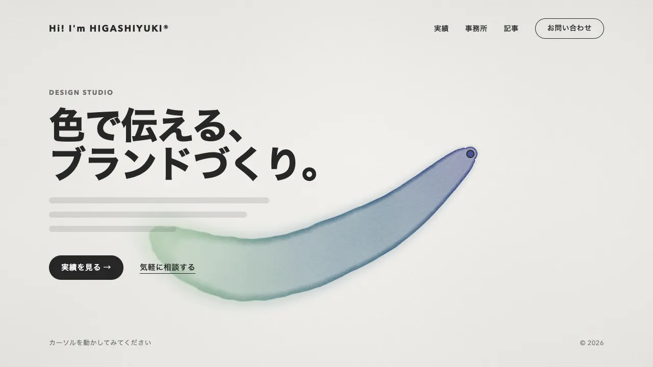
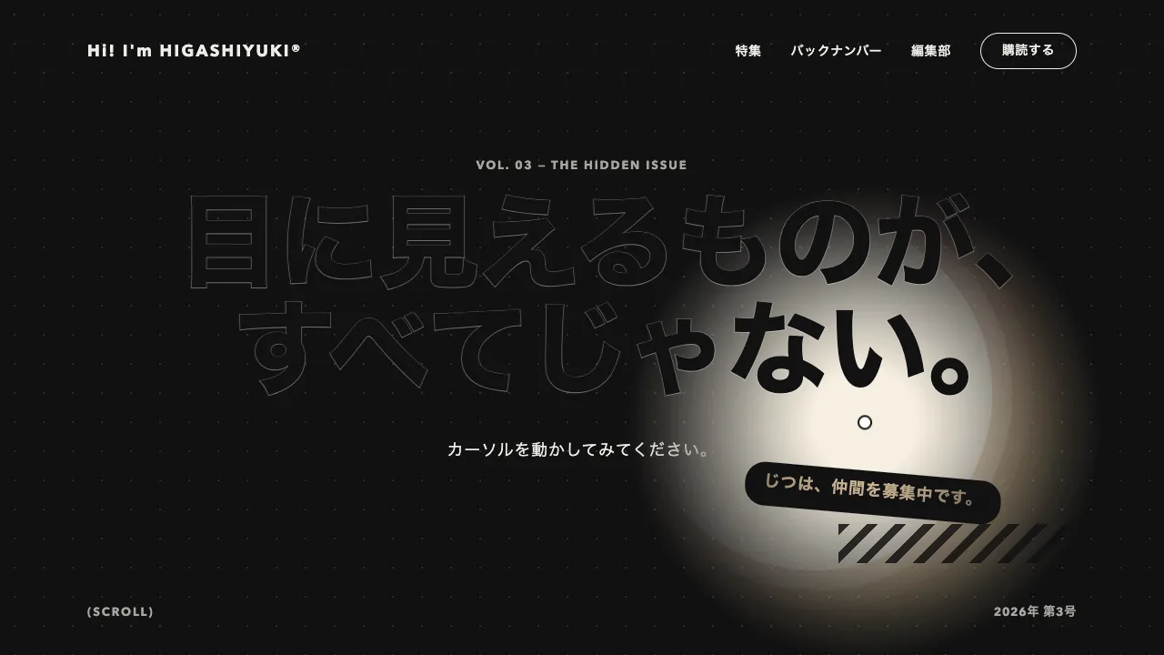
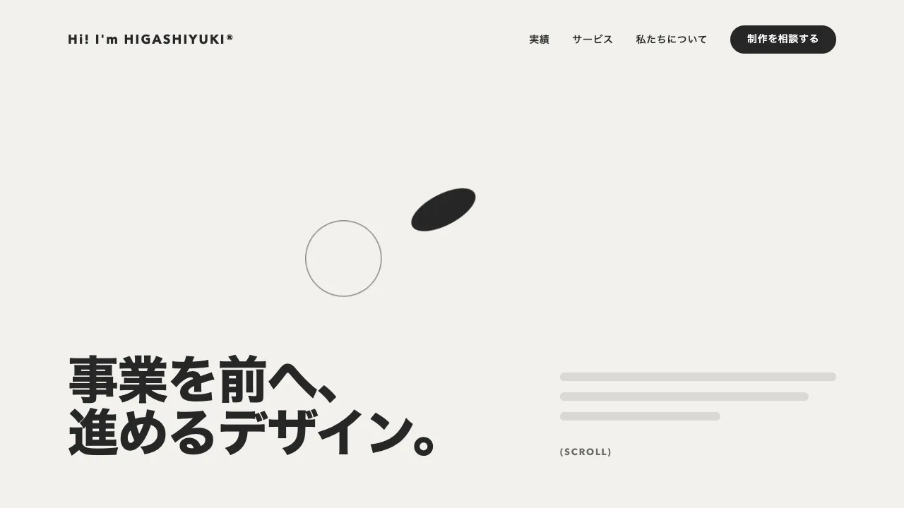
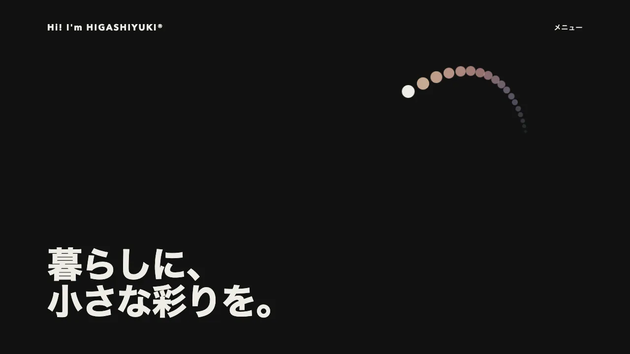
デモ
デモを読み込めませんでした。
仕様
- 用途
- カーソル
- 動作
- DOM
- 種類
- レシピ
- 動作確認
- three 0.186.0・gsap 3.15.0
- 公開日
しくみと調整
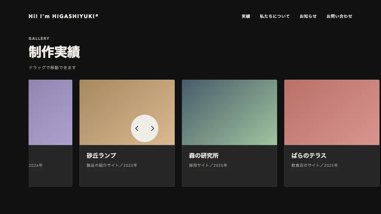
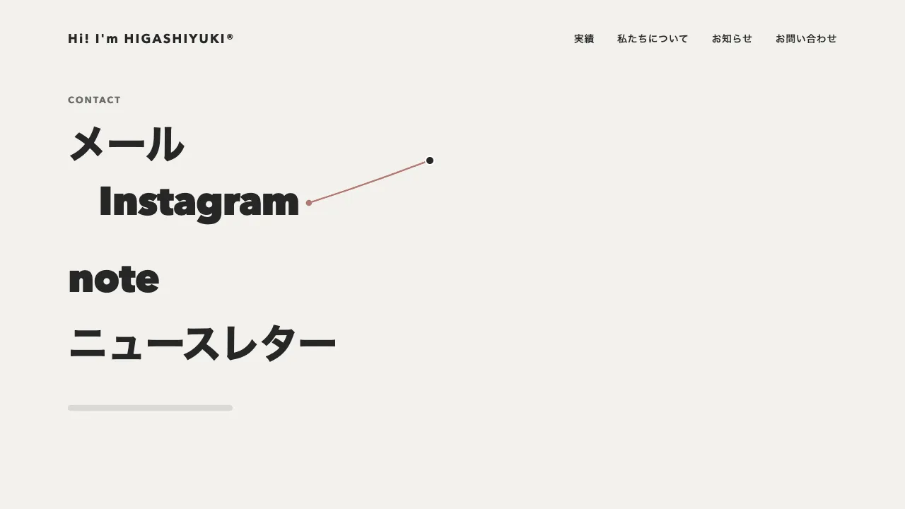
独自カーソルの淡い丸を、乗った部品の形そのものに変えて、部品の後ろに重ねます。丸いアイコンのボタンの上では同じ大きさの円に、カードの上ではカードと同じ四角(角 4px)に、本文のリンクの上では、その行の高さでリンクの文字の幅に左右 6px を足した帯に変わります。形を写す部品には data-cursor-shape を付けるだけで、形はその場で測ります。インラインのリンクは getClientRects でポインタのいる行を選ぶので、2 行に折り返したリンクでも、乗っている行だけに帯が掛かります。
形は、位置・幅・高さ・角の丸みの 5 つの値に分けて持ち、どれも quickTo の 0.3 秒(power3.out)で追わせます。部品の間を渡ると、円から帯へ、帯から四角へと途切れずに形が移ります。ふだんの丸は直径 36px で、ポインタの位置には墨の小さな点を遅れずに置くので、丸が遅れても指している所がわかります。
丸を部品の手前に重ねると、文字やボタンの線を隠してしまいます。そこで節に isolation の isolate を付けて重なりの基準にし、丸を z-index -1 で描きます。こうすると丸は節の地の上、中身の奥に入り、文字の後ろに淡い色が敷かれたように見えます。部品は地を塗らずに罫線だけで組みます。塗りは半透明にせず、地にスレートを 16% 混ぜた不透明な色にし、内側にスレートの 2px の枠を引きます。
キーボードで移ったときも、:focus-visible のときだけ、その部品の形に重ねます(焦点の枠はそのまま残します)。スクロールで部品が動いたら、ポインタの下の部品を測り直します。指で触る端末では独自カーソルを出さず、本物のカーソルのままにします。動きを減らす設定では、遅れを無くしてその場で形を変えます。
つまみは、ふだんの丸の直径、帯の左右の余白と角の丸み、追わせる時間、塗りと枠の色(CSS の変数)です。部品をすき間で囲む輪や、乗ると膨らむ輪と違い、部品の輪郭をそのまま写し取るので、どこを押せるのかと、押せる範囲の広さが同時に伝わります。カードの多い一覧や、本文にリンクの多いサービス紹介、ポートフォリオのページに向いています。
コード
<!-- 形を写してほしい部品に data-cursor-shape を付ける。リンク(インライン)は行の帯、ほかは部品の箱と角の丸みになる -->
<section class="shape-area" aria-labelledby="shape-area-title">
  <div class="shape-area__copy">
    <p class="shape-area__label">SERVICES</p>
    <h2 class="shape-area__title" id="shape-area-title">暮らしの相談を、<br>二つの窓口で</h2>
    <p class="shape-area__lead">はじめての方は、まず<a href="/flow/" data-cursor-shape>ご相談の流れ</a>をご覧ください。<br>料金と対応地域は、<a href="/plans/" data-cursor-shape>プランの一覧</a>にまとめています。</p>
    <div class="shape-area__controls">
      <button class="shape-round" type="button" aria-label="前へ" data-cursor-shape>
        <svg viewBox="0 0 24 24" aria-hidden="true" focusable="false"><path d="M19 12H5M11 6l-6 6 6 6" /></svg>
      </button>
      <button class="shape-round" type="button" aria-label="次へ" data-cursor-shape>
        <svg viewBox="0 0 24 24" aria-hidden="true" focusable="false"><path d="M5 12h14M13 6l6 6-6 6" /></svg>
      </button>
    </div>
  </div>
  <ul class="shape-area__cards">
    <li>
      <a class="shape-card" href="/services/home/" data-cursor-shape>
        <svg class="shape-card__art shape-card__art--slate" viewBox="0 0 224 216" aria-hidden="true" focusable="false">
          <path d="M52 176V112l60-48 60 48v64z" /><path class="cut" d="M96 176v-38h32v38z" /><circle cx="176" cy="52" r="14" />
        </svg>
        <h3 class="shape-card__title">住まいの相談</h3>
        <p class="shape-card__text">引っ越しやリフォームの段取りを、一緒に考えます。</p>
        <span class="shape-card__more">詳しく見る →</span>
      </a>
    </li>
    <li>
      <a class="shape-card" href="/services/money/" data-cursor-shape>
        <svg class="shape-card__art shape-card__art--sage" viewBox="0 0 224 216" aria-hidden="true" focusable="false">
          <ellipse cx="84" cy="164" rx="36" ry="10" /><rect x="48" y="130" width="72" height="34" /><ellipse class="rim" cx="84" cy="130" rx="36" ry="10" />
          <ellipse cx="148" cy="164" rx="30" ry="9" /><rect x="118" y="100" width="60" height="64" /><ellipse class="rim" cx="148" cy="100" rx="30" ry="9" />
        </svg>
        <h3 class="shape-card__title">お金の相談</h3>
        <p class="shape-card__text">家計の見直しから保険まで、専門の担当がお答えします。</p>
        <span class="shape-card__more">詳しく見る →</span>
      </a>
    </li>
  </ul>
  <!-- 独自カーソル。丸は節の中身の奥(節の地の上)、点は手前に描く -->
  <span class="shape-cursor__shape" aria-hidden="true"></span>
  <span class="shape-cursor__dot" aria-hidden="true"></span>
</section>/* isolation で節を重なりの基準にし、z-index: -1 の丸を節の地の上・中身の奥に描く */
.shape-area {
--bg: #f2f1ed;
--ink: #262626;
--mute: #6b6b6b;
--line: rgba(38, 38, 38, 0.12);
--shape-fill: #dddfde; /* 地にスレートを 16% 混ぜた不透明な色 */
--shape-edge: #688297;
--shape-rest: 36px; /* ふだんの丸の直径 */
isolation: isolate;
display: grid;
grid-template-columns: repeat(auto-fit, minmax(min(100%, 420px), 1fr));
align-items: center;
gap: 64px;
padding: 96px clamp(16px, 7.5vw, 96px);
background: var(--bg);
color: var(--ink);
}
.shape-area__label { margin: 0; color: var(--mute); font-size: 13px; font-weight: 700; letter-spacing: 0.14em; }
.shape-area__title {
margin: 24px 0 0;
font-size: clamp(32px, 5vw, 44px);
font-weight: 800;
line-height: 1.1;
letter-spacing: -0.02em;
}
.shape-area__lead { margin: 32px 0 0; font-size: 18px; line-height: 1.8; letter-spacing: 0.04em; word-break: auto-phrase; }
.shape-area__lead a { color: inherit; text-underline-offset: 5px; }
.shape-area__controls { display: flex; gap: 16px; margin-top: 48px; }
/* 地を塗らない(丸が後ろに透けて見えるように) */
.shape-round {
display: grid;
place-items: center;
width: 56px;
height: 56px;
padding: 0;
border: 1px solid var(--ink);
border-radius: 50%;
background: none;
color: var(--ink);
}
.shape-round svg { width: 24px; height: 24px; fill: none; stroke: currentColor; stroke-width: 2; stroke-linecap: round; stroke-linejoin: round; }
.shape-area__cards {
display: grid;
grid-template-columns: repeat(auto-fit, minmax(220px, 1fr));
gap: 32px;
margin: 0;
padding: 0;
list-style: none;
}
.shape-card {
display: block;
padding: 16px;
border: 1px solid var(--line);
border-radius: 4px;
color: inherit;
text-decoration: none;
}
.shape-card__art { display: block; width: 100%; height: auto; background: var(--art-bg); fill: var(--art-fg); }
.shape-card__art--slate { --art-bg: #62839d; --art-fg: #93b2c9; }
.shape-card__art--sage { --art-bg: #6f9770; --art-fg: #a2c49f; }
.shape-card__art .cut { fill: var(--art-bg); }
.shape-card__art .rim { fill: var(--art-bg); stroke: var(--art-fg); stroke-width: 4; }
.shape-card__title { margin: 20px 0 0; font-size: 20px; font-weight: 700; line-height: 1.3; letter-spacing: -0.01em; }
.shape-card__text { margin: 8px 0 0; color: var(--mute); font-size: 14px; line-height: 1.7; letter-spacing: 0.04em; word-break: auto-phrase; }
.shape-card__more { display: block; margin-top: 24px; font-size: 14px; font-weight: 600; letter-spacing: 0.04em; }
.shape-area :focus-visible { outline: 2px solid var(--ink); outline-offset: 4px; }
.shape-cursor__shape,
.shape-cursor__dot {
position: fixed;
left: 0;
top: 0;
pointer-events: none;
visibility: hidden;
}
.shape-cursor__shape {
z-index: -1;
box-sizing: border-box;
background: var(--shape-fill);
box-shadow: inset 0 0 0 2px var(--shape-edge);
}
.shape-cursor__dot { z-index: 1; width: 8px; height: 8px; margin: -4px 0 0 -4px; border-radius: 50%; background: var(--ink); }
/* スクリプトがつないだときだけ、節の中で本物のカーソルを隠す */
.has-shape-cursor,
.has-shape-cursor * { cursor: none; }import { gsap } from "gsap";
const PAD = 6; // リンクの行の帯を、文字の幅から左右に広げる量(px)
const BAND = 4; // 行の帯の角の丸み(px)
// 指で触る端末にはポインタが無いので、独自カーソルは出さず本物のカーソルのままにする
const canHover = window.matchMedia("(hover: hover) and (pointer: fine)").matches;
const reduceMotion = window.matchMedia("(prefers-reduced-motion: reduce)").matches;
document.querySelectorAll(".shape-area").forEach((area) => {
const shape = area.querySelector(".shape-cursor__shape");
const dot = area.querySelector(".shape-cursor__dot");
if (!shape || !dot || !canHover) return;
area.classList.add("has-shape-cursor");
const rest = parseFloat(getComputedStyle(area).getPropertyValue("--shape-rest"));
const state = { x: 0, y: 0, w: rest, h: rest, r: rest / 2 };
const draw = () => gsap.set(shape, { x: state.x - state.w / 2, y: state.y - state.h / 2, width: state.w, height: state.h, borderRadius: state.r });
// 位置・幅・高さ・角の丸みを別々に追わせる(scale で合わせると枠の線まで太る)。
// quickTo に duration 0 を渡すと動かないので、動きを減らす設定ではその場に置く
const to = {};
for (const key of Object.keys(state)) {
to[key] = reduceMotion ? (v) => ((state[key] = v), draw()) : gsap.quickTo(state, key, { duration: 0.3, ease: "power3", onUpdate: draw });
}
// 部品の形。インラインのリンクはポインタのいる行の帯(行の高さ)、ほかは箱と角の丸み
const fit = (el, x, y) => {
const css = getComputedStyle(el);
if (css.display === "inline") {
const rects = [...el.getClientRects()];
const line = rects.find((r) => y >= r.top && y <= r.bottom) ?? rects[0];
const height = parseFloat(getComputedStyle(el.parentElement).lineHeight);
return { x: line.left + line.width / 2, y: line.top + line.height / 2, w: line.width + PAD * 2, h: height, r: BAND };
}
const box = el.getBoundingClientRect();
const radius = css.borderTopLeftRadius;
const r = radius.endsWith("%") ? (Math.min(box.width, box.height) * parseFloat(radius)) / 100 : parseFloat(radius);
return { x: box.left + box.width / 2, y: box.top + box.height / 2, w: box.width, h: box.height, r };
};
const goal = (el, x, y) => (el ? fit(el, x, y) : { x, y, w: rest, h: rest, r: rest / 2 });
const aim = (g) => Object.keys(g).forEach((key) => to[key](g[key]));
// 隠れていたら、左上から飛んでこないよう、その形で置いてから出す
let shown = false;
const show = (g, withDot) => {
if (withDot) gsap.set(dot, { autoAlpha: 1 });
if (shown) return;
shown = true;
Object.assign(state, g);
draw();
gsap.to(shape, { autoAlpha: 1, duration: reduceMotion ? 0 : 0.2 });
};
const hide = () => {
shown = false;
gsap.to([shape, dot], { autoAlpha: 0, duration: reduceMotion ? 0 : 0.2 });
};
let pointer = null;
const update = () => {
const { x, y } = pointer;
const hit = document.elementFromPoint(x, y)?.closest("[data-cursor-shape]");
const g = goal(hit && area.contains(hit) ? hit : null, x, y);
gsap.set(dot, { x, y });
show(g, true);
aim(g);
};
area.addEventListener("pointermove", (event) => {
if (event.pointerType === "touch") return;
pointer = { x: event.clientX, y: event.clientY };
update();
});
area.addEventListener("pointerleave", () => {
pointer = null;
hide();
});
// スクロールで部品が動いても、ポインタの下の部品に合わせ直す
window.addEventListener("scroll", () => pointer && update(), { passive: true });
// キーボードで移ったときも、その部品の形に重ねる(マウスで押したときの焦点は除く)
area.addEventListener("focusin", (event) => {
const el = event.target.closest("[data-cursor-shape]");
if (!el || !event.target.matches(":focus-visible")) return;
const g = fit(el, 0, 0);
show(g, false);
aim(g);
});
area.addEventListener("focusout", () => pointer || hide());
});