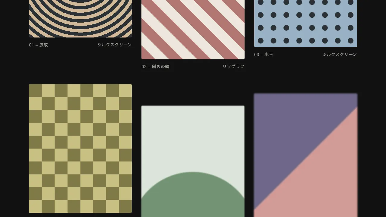
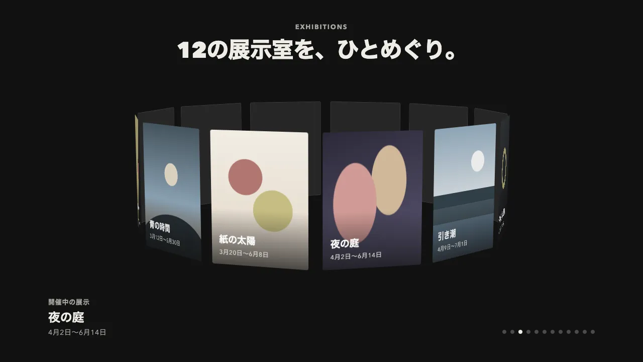
デモ
デモを読み込めませんでした。
仕様
- 用途
- カード
- 動作
- DOM
- 種類
- レシピ
- 動作確認
- three 0.186.0・gsap 3.15.0
- 公開日
しくみと調整
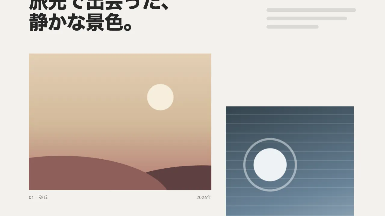
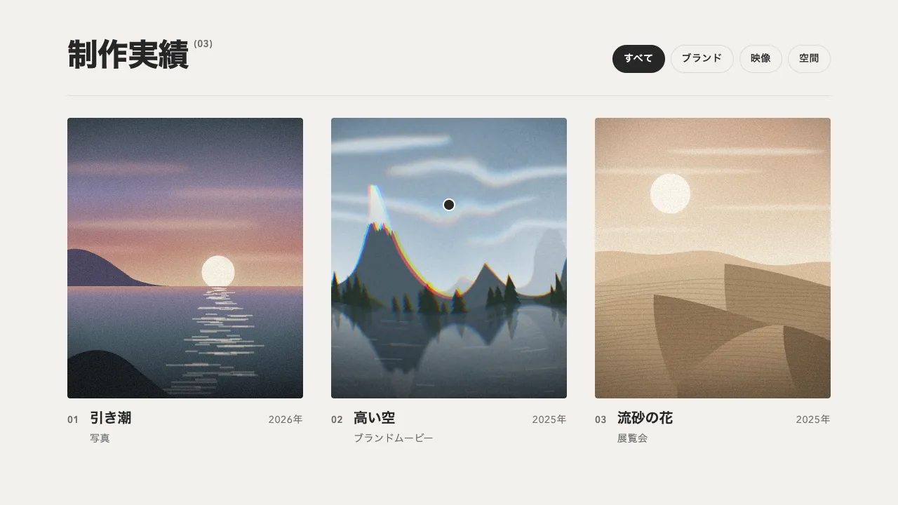
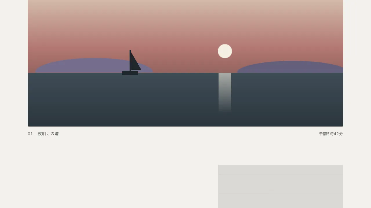
画像の枠に色の帯を重ね、帯が左から伸びて覆いきった瞬間に画像を表示し、今度は右へ縮めて抜いていきます。画像は現れた瞬間は少し寄っていて、そこからゆっくり引いて落ち着きます。
帯が覆う時間は 0.55 秒、抜ける時間は 0.6 秒です。画像が寄りから引くのにかける時間は 1.4 秒で、帯より長くすることで、抜けたあとも動きが続いて見えます。
帯が覆いきる前に画像を表示すると、抜ける途中で下の画像が透けて見えてしまいます。覆いきった瞬間にちょうど表示を切り替えるのがこつです。帯の色は画像ごとに変えられるので、ブランドカラーを差し込む余地にもなります。
画面に入った 1 回だけ走らせ、繰り返しません。縦に走らせたいときは、伸び縮みの向きと帯の原点を上下に変えれば同じしくみで作れます。
ポートフォリオや記事のメイン画像、ギャラリーの出現に向いています。
コード
<div class="wipe-gallery">
  <figure class="wipe" style="--bar: #d29b97">
    <img class="wipe__image" src="/images/reveal-seaside.jpg" alt="">
    <span class="wipe__bar" aria-hidden="true"></span>
    <figcaption class="wipe__caption">01 海辺の夕暮れ</figcaption>
  </figure>
  <figure class="wipe" style="--bar: #d2b999">
    <img class="wipe__image" src="/images/reveal-meadow.jpg" alt="">
    <span class="wipe__bar" aria-hidden="true"></span>
    <figcaption class="wipe__caption">02 草原の朝</figcaption>
  </figure>
  <figure class="wipe" style="--bar: #98b1c4">
    <img class="wipe__image" src="/images/reveal-moonlit-cove.jpg" alt="">
    <span class="wipe__bar" aria-hidden="true"></span>
    <figcaption class="wipe__caption">03 月夜の入り江</figcaption>
  </figure>
</div>.wipe-gallery {
--bg: #111111;
--ink: #eeece6;
display: grid;
grid-template-columns: repeat(auto-fit, minmax(240px, 1fr));
gap: 24px;
padding: 64px clamp(16px, 6vw, 96px);
background: var(--bg);
}
.wipe {
position: relative;
overflow: hidden;
margin: 0;
aspect-ratio: 4 / 5;
border-radius: 4px;
}
.wipe__image {
position: absolute;
inset: 0;
width: 100%;
height: 100%;
object-fit: cover;
visibility: hidden;
}
.wipe__bar {
position: absolute;
inset: 0;
background: var(--bar);
transform: scaleX(0);
transform-origin: 0% 50%;
}
.wipe__caption {
position: absolute;
left: 20px;
bottom: 20px;
color: var(--ink);
font-size: 18px;
font-weight: 700;
letter-spacing: -0.01em;
text-shadow: 0 2px 10px rgba(0, 0, 0, 0.5);
}import { gsap } from "gsap";
const COVER = 0.55; // 帯が覆う時間(秒)
const UNCOVER = 0.6; // 帯が抜ける時間(秒)
const ZOOM = 1.3; // 出た瞬間の画像の寄り。ここから 1 まで引く
const reduceMotion = matchMedia("(prefers-reduced-motion: reduce)").matches;
document.querySelectorAll(".wipe").forEach((frame) => {
const bar = frame.querySelector(".wipe__bar");
const img = frame.querySelector(".wipe__image");
gsap.set(img, { autoAlpha: 0 });
// 帯は左を原点に伸びて覆い、覆いきった瞬間に画像を出して、右を原点に縮んで抜ける
const reveal = gsap
.timeline({ paused: true })
.fromTo(bar, { scaleX: 0, transformOrigin: "0% 50%" }, { scaleX: 1, duration: COVER, ease: "power4.inOut" })
.set(img, { autoAlpha: 1 })
.set(bar, { transformOrigin: "100% 50%" })
.to(bar, { scaleX: 0, duration: UNCOVER, ease: "power4.inOut" })
.fromTo(img, { scale: ZOOM }, { scale: 1, duration: 1.4, ease: "expo.out" }, "<");
// 動きを減らす設定では、出きった状態で見せる
if (reduceMotion) {
reveal.progress(1);
return;
}
// 画面に入ったら 1 回だけ走らせる
const io = new IntersectionObserver(
([entry], self) => {
if (!entry.isIntersecting) return;
self.unobserve(entry.target);
reveal.play();
},
{ rootMargin: "0px 0px -15%" }
);
io.observe(frame);
});