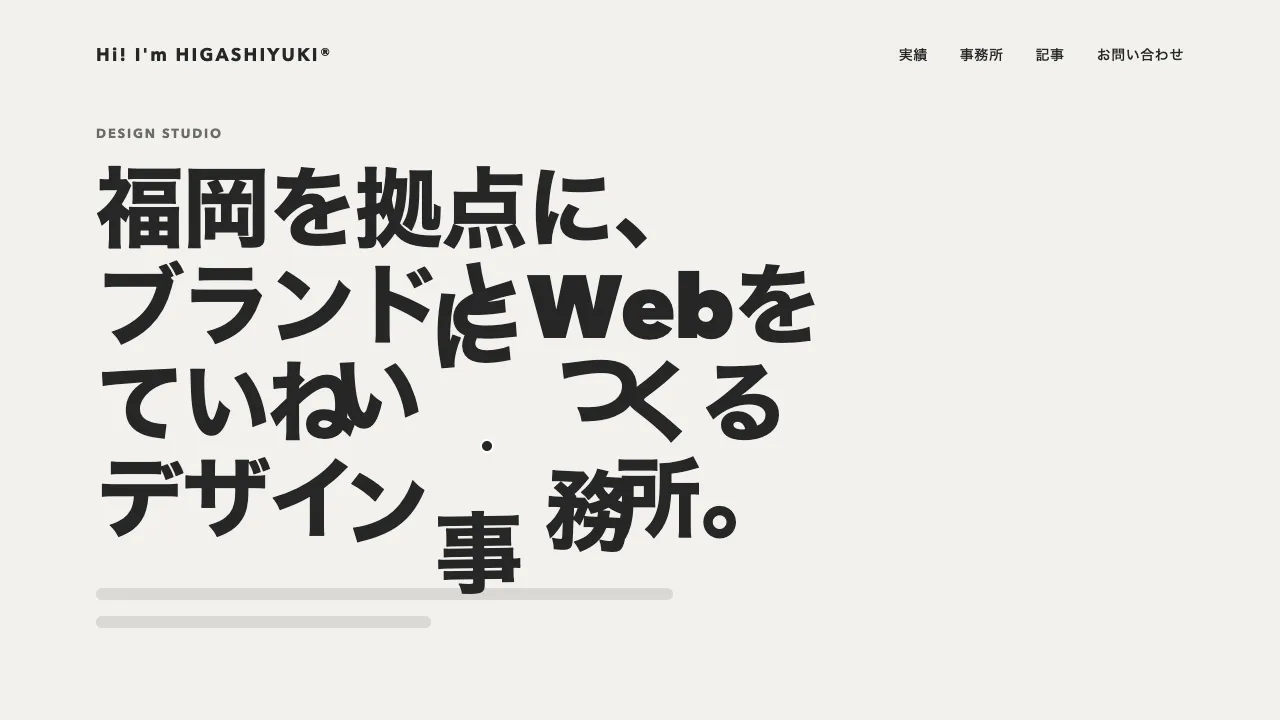
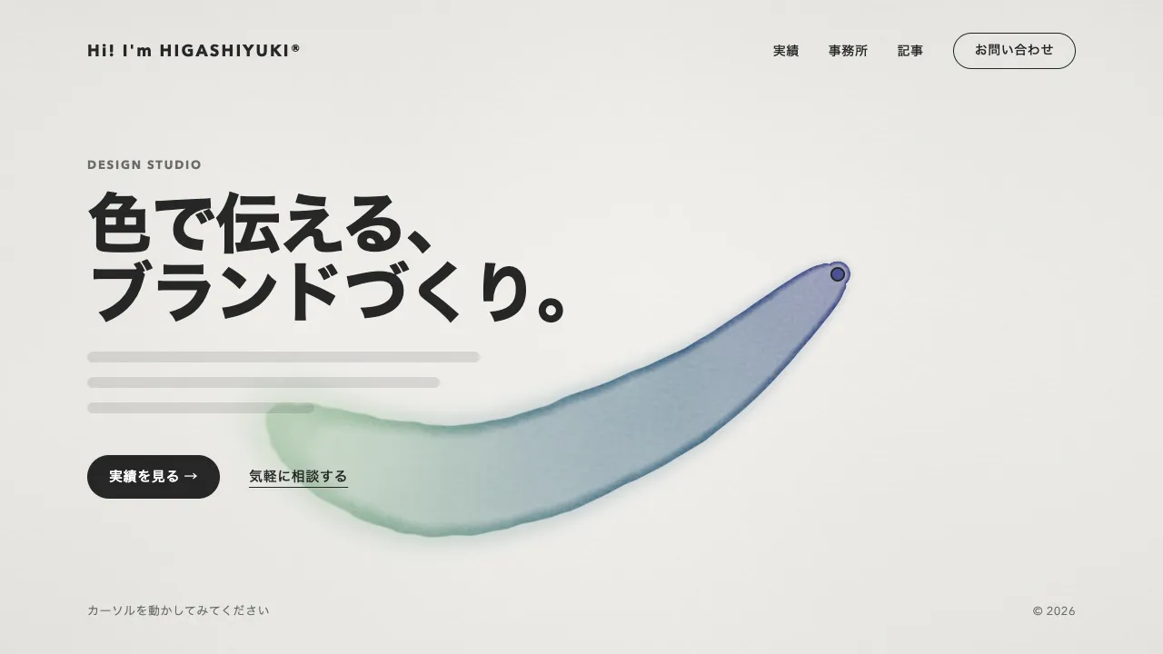
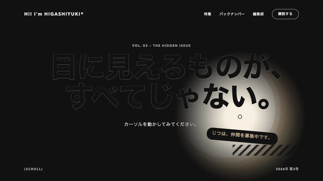
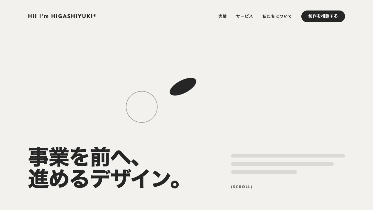
デモ
デモを読み込めませんでした。
仕様
- 用途
- カーソル
- 動作
- DOM
- 種類
- レシピ
- 動作確認
- three 0.186.0・gsap 3.15.0
- 公開日
しくみと調整
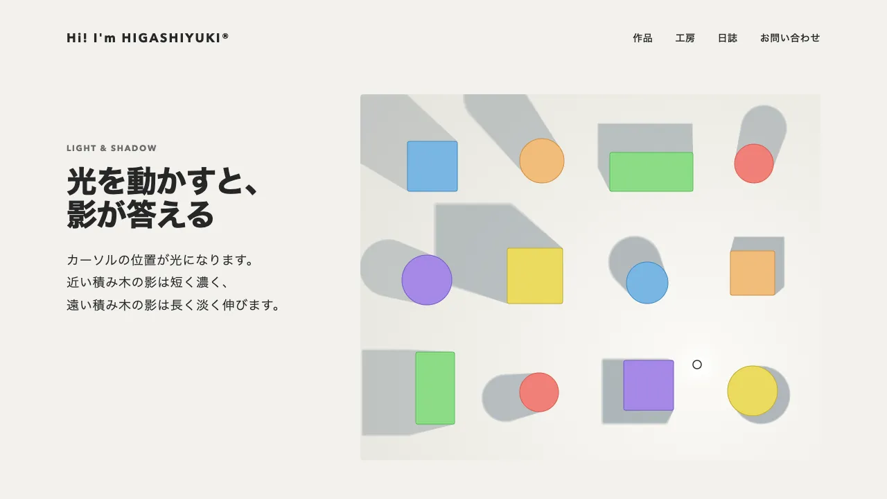
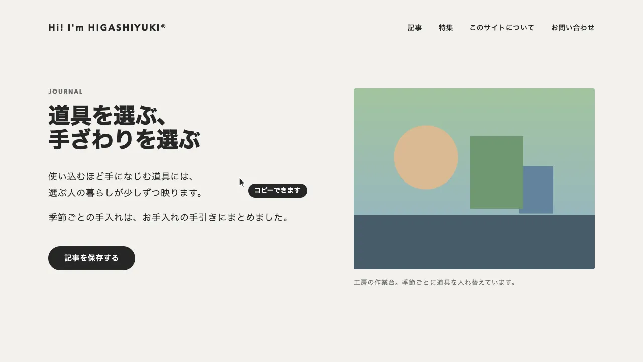
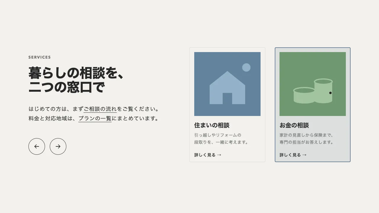
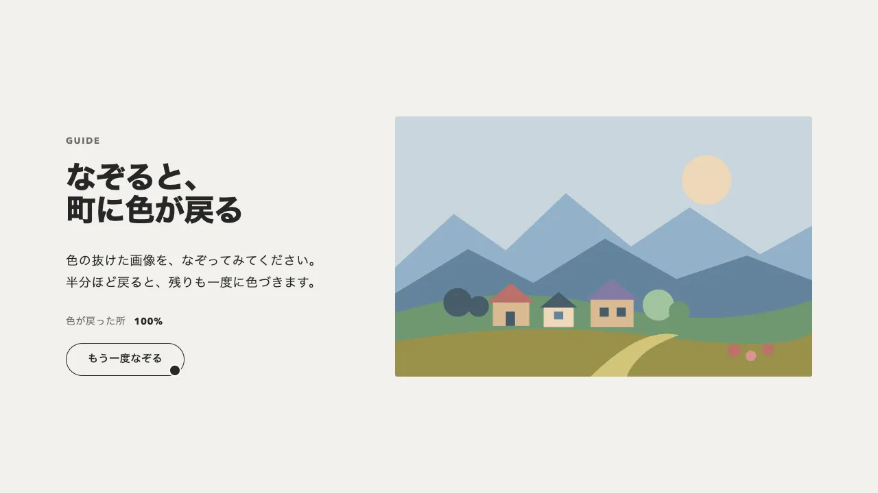
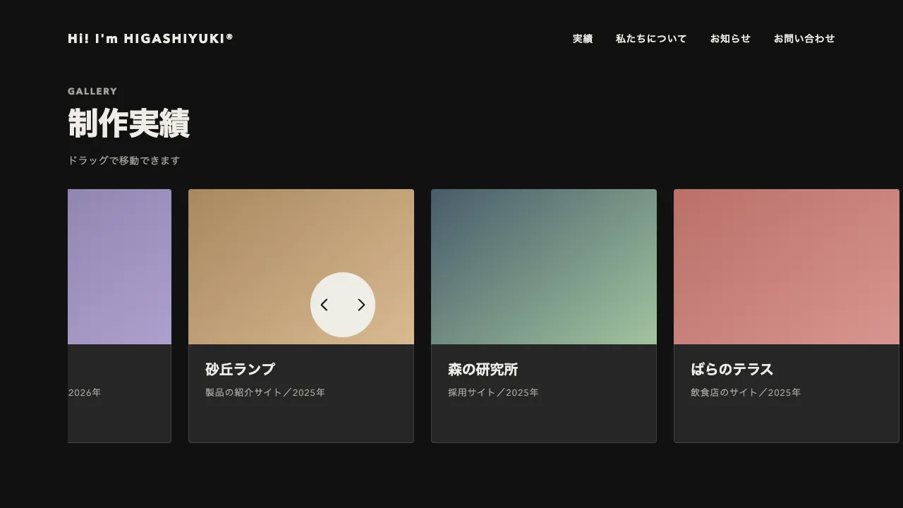
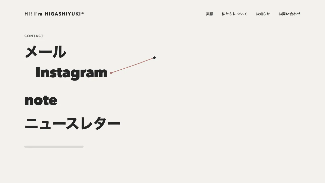
独自カーソルの輪を画面に固定し、ポインタを少し遅れて追わせます。リンクやボタンの上では輪を大きくして薄く色を付け、作品の画像の上ではさらに大きな塗りの円にして「詳しく見る」を出します。どの状態にするかは、ポインタが乗った要素から closest でたどって決めるので、あとから足したリンクや、差し替えたページの中にもそのまま効きます。
輪の直径は、ふだん 36px、リンクの上で 84px、画像の上で 144px です。大きさと色はどれも 0.4 秒の power3.out で、入った・出たのたびに今の大きさから補間し直すので、要素の間を素早く渡っても跳びません。リンクの上の塗りは 16% の薄さにとどめ、画像の上では塗りを 100% にして輪の線を消し、白い文言を載せます。輪がポインタに追いつくのは 0.25 秒で、点は遅れずに付きます。
大きさを scale で変えると、輪の線まで太ってしまいます。幅と高さそのものを動かしてください。中心をポインタに合わせる指定も忘れやすく、xPercent と yPercent を -50 にしておかないと、大きくなるたびに輪が右下へずれていきます。乗るたびにトゥイーンを作り直すので、overwrite を auto にして、前のトゥイーンの同じ値を止めます。
キーボードで移ったときは、輪をその要素の中央へ動かして同じ見た目にします。マウスで押したときにも焦点は移るので、:focus-visible のときだけ動かし、押した所から輪が跳ばないようにします。指で触る端末では独自カーソルを出さず、本物のカーソルも、独自カーソルを出したときだけ隠します。
つまみは、3 つの状態の直径と塗りの濃さ、大きさを変える時間、輪が追いつく時間です。文言を「再生する」や「ドラッグ」に替えれば、動画やスライダーの上でも使えます。ポートフォリオやスタジオのサイトで、リンクと作品を指し分けるカーソルに向いています。
コード
<!-- 輪が膨らむのは a と button の上。「詳しく見る」を出したい所には data-cursor="view" を付ける -->
<section class="intro" aria-labelledby="intro-title">
  <h2 class="intro__title" id="intro-title">心を動かす、<br>ものづくりを。</h2>
  <p class="intro__lead">ここに説明文が入ります。</p>
  <p class="intro__actions">
    <a class="button" href="/contact/">制作を相談する</a>
    <a class="text-link" href="/work/">実績を見る <span aria-hidden="true">→</span></a>
  </p>
  <a class="work" href="/work/shiosai-coffee/" data-cursor="view">
    <img src="/img/shiosai-coffee.jpg" alt="しおさい珈琲のブランディング" width="464" height="432">
  </a>
</section>

<!-- 独自カーソル。飾りなので読み上げから外し、body の終わりに置く -->
<div class="cursor-ring" aria-hidden="true"><span class="cursor-ring__label">詳しく見る</span></div>
<span class="cursor-dot" aria-hidden="true"></span>:root {
--cursor-rest: 36px; /* ふだんの輪の直径 */
--cursor-link: 84px; /* リンクやボタンの上 */
--cursor-view: 144px; /* data-cursor="view" の上 */
--cursor-ink: #262626; /* 輪の線と点 */
--cursor-accent: #4a5b66; /* 膨らんだ輪の塗り。白い文言が載るので濃い色に */
}
.cursor-ring,
.cursor-dot {
position: fixed;
left: 0;
top: 0;
z-index: 9999;
border-radius: 50%;
/* 下のリンクやボタンを押せるようにする */
pointer-events: none;
/* JS がつないだときだけ出す。指で触る端末やスクリプトが動かないときは本物のカーソルのまま */
display: none;
}
.cursor-ring {
width: var(--cursor-rest);
height: var(--cursor-rest);
box-sizing: border-box;
border: 2px solid var(--cursor-ink);
/* 文言が輪より広いときも、左右へ均等にはみ出すよう flex で中央に置く */
align-items: center;
justify-content: center;
}
.cursor-ring__label {
flex: none;
color: #ffffff;
font-size: 15px;
font-weight: 700;
letter-spacing: 0.04em;
white-space: nowrap;
opacity: 0;
}
.cursor-dot {
width: 10px;
height: 10px;
background: var(--cursor-ink);
}
.has-custom-cursor .cursor-ring { display: flex; }
.has-custom-cursor .cursor-dot { display: block; }
/* 本物のカーソルは、独自カーソルを出したときだけ隠す */
.has-custom-cursor,
.has-custom-cursor a,
.has-custom-cursor button {
cursor: none;
}
/* ページの外へ出たあいだは隠す(端に貼り付いたまま残らないように) */
.cursor-away .cursor-ring,
.cursor-away .cursor-dot {
visibility: hidden;
}
.intro { color: var(--cursor-ink); }
.intro__title { margin: 0; font-size: clamp(44px, 7vw, 72px); font-weight: 800; line-height: 1.05; letter-spacing: -0.02em; }
.intro__lead { margin: 24px 0 0; font-size: 18px; line-height: 1.8; letter-spacing: 0.04em; }
.intro__actions { display: flex; align-items: center; gap: 32px; margin: 48px 0; font-size: 15px; font-weight: 600; }
.button {
display: inline-flex;
align-items: center;
height: 48px;
padding: 0 24px;
border-radius: 999px;
background: #262626;
color: #ffffff;
text-decoration: none;
}
.text-link { color: inherit; text-underline-offset: 0.4em; }
.work { display: block; width: fit-content; max-width: 100%; border-radius: 4px; overflow: hidden; }
.work img { display: block; max-width: 100%; height: auto; }
.intro a:focus-visible { outline: 2px solid var(--cursor-ink); outline-offset: 4px; }import { gsap } from "gsap";
const ring = document.querySelector(".cursor-ring");
const dot = document.querySelector(".cursor-dot");
// 指で触る端末にはポインタが無いので、独自カーソルは出さず本物のカーソルのままにする
const canHover = window.matchMedia("(hover: hover) and (pointer: fine)").matches;
const reduceMotion = window.matchMedia("(prefers-reduced-motion: reduce)").matches;
if (ring && dot && canHover) {
const label = ring.querySelector(".cursor-ring__label");
const css = getComputedStyle(ring);
const read = (name) => css.getPropertyValue(name).trim();
const [ar, ag, ab] = gsap.utils.splitColor(read("--cursor-accent"));
const [ir, ig, ib] = gsap.utils.splitColor(read("--cursor-ink"));
// 塗りの濃さ(0〜1)に合わせて、輪の線を薄くする。1 で線が消えて、塗りの円になる
const tint = (fill) => ({ backgroundColor: `rgba(${ar}, ${ag}, ${ab}, ${fill})`, borderColor: `rgba(${ir}, ${ig}, ${ib}, ${1 - fill})` });
const STATES = {
rest: { size: read("--cursor-rest"), fill: 0, label: 0 },
link: { size: read("--cursor-link"), fill: 0.16, label: 0 },
view: { size: read("--cursor-view"), fill: 1, label: 1 },
};
const GROW = reduceMotion ? 0 : 0.4; // 大きさと色を変える時間(秒)。動きを減らす設定では一瞬で
const CHASE = 0.25; // 輪がポインタに追いつく時間(秒)
// 中心をポインタに合わせる。大きさを変えても中心がずれない
gsap.set([ring, dot], { xPercent: -50, yPercent: -50 });
gsap.set(ring, tint(0));
document.documentElement.classList.add("has-custom-cursor");
// 動きを減らす設定では遅れなし(quickTo は duration が 0 だと値が動かない)
const follow = (prop) => (reduceMotion ? (value) => gsap.set(ring, { [prop]: value }) : gsap.quickTo(ring, prop, { duration: CHASE, ease: "power3" }));
const moveX = follow("x");
const moveY = follow("y");
const place = (x, y) => {
gsap.set(dot, { x, y }); // 点は遅れなし
moveX(x);
moveY(y);
};
let current = STATES.rest;
// 今の大きさと色から、次の状態へ補間し直す。大きさは scale ではなく width / height で変える(scale だと輪の線まで太る)
const to = (state) => {
if (state === current) return;
current = state;
const vars = { duration: GROW, ease: "power3.out", overwrite: "auto" };
gsap.to(ring, { width: state.size, height: state.size, ...tint(state.fill), ...vars });
gsap.to(label, { opacity: state.label, ...vars });
gsap.to(dot, { opacity: 1 - state.label, ...vars }); // 文言が出ている間は、点を消して重ねない
};
// 乗った要素から状態を決める。あとから足したリンクや、差し替えたページの中にも効く
const stateOf = (el) => (el.closest("[data-cursor='view']") ? STATES.view : el.closest("a, button") ? STATES.link : STATES.rest);
window.addEventListener("pointermove", (event) => place(event.clientX, event.clientY));
document.addEventListener("pointerover", (event) => to(stateOf(event.target)));
const page = document.documentElement;
page.addEventListener("pointerleave", () => page.classList.add("cursor-away"));
page.addEventListener("pointerenter", () => page.classList.remove("cursor-away"));
// キーボードで移ったときも、輪をその要素の中央へ動かして同じ見た目にする(マウスで押したときの focus は除く)
let byKeys = false;
document.addEventListener("focusin", (event) => {
byKeys = event.target.matches(":focus-visible");
if (!byKeys) return;
const box = event.target.getBoundingClientRect();
place(box.left + box.width / 2, box.top + box.height / 2);
to(stateOf(event.target));
});
document.addEventListener("focusout", () => {
if (byKeys) to(STATES.rest);
byKeys = false;
});
}