デモ
デモを読み込めませんでした。
仕様
- 用途
- カーソル
- 動作
- DOM
- 種類
- レシピ
- 動作確認
- three 0.186.0・gsap 3.15.0
- 公開日
しくみと調整
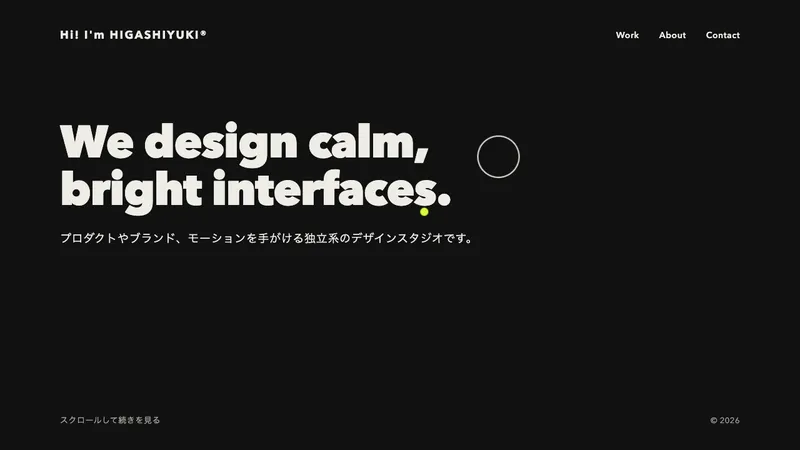
ふだんは小さな点のカーソルを画面に固定しておき、作品の上に入ったら丸を大きくして、中の文言を下から送り出します。文言と丸の色は作品ごとに data-cursor の組で決めておき、入った先の設定をそのまま丸に渡します。丸には overflow の hidden を付けてあるので、文言は丸の外へはみ出さずに切り抜かれます。
点は直径 14px、ラベルの丸は 136px で、大きくなる時間も文言が入れ替わる時間も 0.45 秒にそろえています。丸がポインタに追いつく時間は 0.2 秒と短くして、点でいるあいだはほとんど遅れて見えないようにしています。大きさを scale で変えないのがこの作りの肝で、拡大すると中の文字まで一緒に伸びてしまうため、幅と高さの数値そのものを動かします。
作品から作品へ直に渡ると、前の文言が上へ抜けながら次の文言が下から入ります。このとき前の動きが残っていると値を取り合って途中で飛ぶので、overwrite を auto にして古いほうを捨てさせます。中心をポインタに合わせる指定も要り、抜けると大きくなるたびに丸が右下へふくらんで見えます。
つまみは、点とラベルの直径、大きくなる時間、文言が入れ替わる時間の 4 つです。文言を「ドラッグ」に替えれば横に流れるスライダーにも使え、三角の印を添えれば動画の再生にも読み替えられます。作品一覧や動画のサムネイルに向いています。ポインタの無い端末では出さず、本物のカーソルのままにします。
コード
<section class="work" aria-labelledby="work-title">
  <h2 class="work__title" id="work-title">Selected work</h2>
  <ul class="work__grid">
    <li>
      <!-- data-cursor は丸に出す文言の名前、data-cursor-color は丸の地の色 -->
      <a class="work__tile" href="/work/obsidian/" data-cursor="view" data-cursor-color="#ffffff">
        <img src="/img/obsidian.jpg" alt="Obsidian の製品映像">
      </a>
      <p class="work__caption"><span>Obsidian</span><span>製品映像/2026年</span></p>
    </li>
    <li>
      <a class="work__tile" href="/work/showreel/" data-cursor="play" data-cursor-color="#ffd64a">
        <img src="/img/showreel.jpg" alt="2026年のショーリール">
      </a>
      <p class="work__caption"><span>Showreel 2026</span><span>映像</span></p>
    </li>
  </ul>
</section>

<!-- 独自カーソル。文言は data-cursor の値ごとに 1 つずつ入れておく -->
<div class="cursor" aria-hidden="true">
  <span class="cursor__label" data-label="view">詳しく見る</span>
  <span class="cursor__label" data-label="play">再生する</span>
</div>.cursor {
--dot: 14px;
--label: 136px;
--dot-color: #262626;
position: fixed;
left: 0;
top: 0;
z-index: 9999;
width: var(--dot);
height: var(--dot);
border-radius: 50%;
background: var(--dot-color);
/* 文言を丸の中だけに見せる。丸からはみ出した分は切り抜かれる */
overflow: hidden;
pointer-events: none;
display: none;
}
.cursor__label {
position: absolute;
inset: 0;
display: flex;
align-items: center;
justify-content: center;
color: #262626;
font-size: 16px;
font-weight: 700;
letter-spacing: 0.04em;
white-space: nowrap;
}
/* JS がつないだときだけ出す。ポインタの無い端末では本物のカーソルのまま */
.has-custom-cursor .cursor {
display: block;
}
.has-custom-cursor,
.has-custom-cursor a {
cursor: none;
}
.work__grid {
display: grid;
grid-template-columns: 2fr 1fr;
gap: 24px;
margin: 0;
padding: 0;
list-style: none;
}
.work__tile {
display: block;
overflow: hidden;
border-radius: 4px;
}
.work__tile img {
display: block;
width: 100%;
height: 360px;
object-fit: cover;
}
.work__tile:focus-visible {
outline: 2px solid #262626;
outline-offset: 4px;
}
.work__caption {
display: flex;
justify-content: space-between;
gap: 16px;
margin: 16px 0 0;
}import { gsap } from "gsap";
const cursor = document.querySelector(".cursor");
// 指で触る端末にはポインタが無いので、独自カーソルは出さず本物のカーソルのままにする
const canHover = window.matchMedia("(hover: hover) and (pointer: fine)").matches;
const reduceMotion = window.matchMedia("(prefers-reduced-motion: reduce)").matches;
if (cursor && canHover) {
const style = getComputedStyle(cursor);
const dot = style.getPropertyValue("--dot").trim();
const label = style.getPropertyValue("--label").trim();
const dotColor = style.getPropertyValue("--dot-color").trim();
// 大きさを変えても位置がずれないよう、中心をポインタに合わせる
gsap.set(cursor, { xPercent: -50, yPercent: -50 });
gsap.set(cursor.querySelectorAll("[data-label]"), { yPercent: 100 });
document.documentElement.classList.add("has-custom-cursor");
// 動きを減らす設定では、遅れも送りもほぼ一瞬にする
const chase = reduceMotion ? 0 : 0.2;
const swap = reduceMotion ? 0.05 : 0.45;
const moveX = gsap.quickTo(cursor, "x", { duration: chase, ease: "power3" });
const moveY = gsap.quickTo(cursor, "y", { duration: chase, ease: "power3" });
window.addEventListener("pointermove", (event) => {
moveX(event.clientX);
moveY(event.clientY);
});
document.querySelectorAll("[data-cursor]").forEach((target) => {
const text = cursor.querySelector(`[data-label="${target.dataset.cursor}"]`);
if (!text) return;
// 大きさは scale ではなく width / height で変える(scale だと中の文字まで伸びる)
const grow = (size, color) => {
gsap.to(cursor, { width: size, height: size, backgroundColor: color, duration: swap, ease: "power3.out", overwrite: "auto" });
};
// 対象から対象へ直に渡ると、前の文言が上へ抜けながら次の文言が下から入る
const show = () => {
grow(label, target.dataset.cursorColor || dotColor);
gsap.fromTo(text, { yPercent: 100 }, { yPercent: 0, duration: swap, ease: "power3.out", overwrite: "auto" });
};
const hide = () => {
grow(dot, dotColor);
gsap.to(text, { yPercent: -100, duration: swap, ease: "power3.out", overwrite: "auto" });
};
target.addEventListener("pointerenter", show);
target.addEventListener("pointerleave", hide);
// キーボードで送ったときも、丸を対象の中央へ置いて同じ見た目にする
target.addEventListener("focus", () => {
const rect = target.getBoundingClientRect();
moveX(rect.left + rect.width / 2);
moveY(rect.top + rect.height / 2);
show();
});
target.addEventListener("blur", hide);
});
}